CSS Grid - Introduction and Terminologies
CSS Grid came into the limelight recently(a few years ago) but its presence has been there since old IE days. CSS Grid solves the problem area of two-dimensional layouts.
There have been multiple attempts to solve the designing layout using other properties in CSS - position hacks, floats, table, flex are such very popular examples with comes with their own set of problems.

Syntactically and visually, we can achieve the 2D layouts using flexbox or tables then why do we need a grid in the picture? Grid brings a very unique quality with itself – Semantics. Tables are semantically for table layouts or tabular structured data, flexbox is semantically there for 1-dimensional flexible layouts (navigation bars, etc). In that same essence, Grids are for 2-dimensional layouts.
CSS is a declarative language, when you need something to be of let's say red color. You declare it as color red by adding a declaration { color: red; }

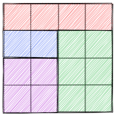
excuse this poor imitation of xkcd, the original one for regex is a lot better - https://xkcd.com/208/
When the grid was not available we used tables and flexbox to create grid like layouts which was not semantically correct and also hard to pull off in some way. Tables and flexbox usages still hold place today for what they were meant to be. In the end, CSS Grid is just another tool in our toolbox. And as the saying goes - use the right tool, for the right job. It blends well with other layout systems like it is perfectly valid to create a flexbox container inside a CSS grid element.
In this post, we will uncover the very fundamental terminologies of the CSS grid that we need to get acquainted with, and then in upcoming posts, we'll dive into other aspects.
- Grid container
- Grid item
- Grid lines
- Grid track
- Grid cell
- Grid area
- Rows and columns
- The end
- References mentioned in the post
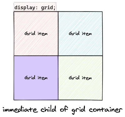
Grid container
So, what are grid container? In simple terms, grid container is an element that defines grid formatting context.

What's this grid formatting context?
Formatting context
To answer that, let's understand what is formatting context in general. Formatting contexts define the rules on how the content is going to layout visually and with the combination of other properties, how it affects the layout. This is not something new in CSS, it has been around since the beginning. You may not have known the term before, but for sure you have experienced it.
For example, when you use display: flex; it sets the element to be of flex formatting context and then by using flex related properties we can change the layout of its child. There are many such formatting contexts, like when you use a <p></p> tag, it creates an inline formatting context which alters the behaviour of the box model as compared to the default block formatting context.
There are many helpful resources available on internet to understand formatting context. I would recommend an introductory article on MDN and this article by Rachel Andrew on CSS Layout And The Block Formatting Context
Coming back to grid formatting context. How do we create such a thing? By adding the declaration display: grid; or display: inline-grid; to an element. With this, we create a new grid formatting context and the element will be known as grid container.
Block level and Inline level grid container
We can create grid containers in two fashion – block-level and inline-level. Block-level grid follows the block direction (top-to-bottom for most languages) and gets placed on its own line like a div, section, p. Inline level grid, follows the inline direction (left-to-right) placed along with other inline elements for eg. span, strong.
See the Pen block-inline-grid by Ravi Sharma (@rvisharma) on CodePen.
📌 If an inline-grid container has
position: absolute;orfloatin its properties, theninlinegets dropped and it becomes a regular block grid container.
Block grid and Block containers
Block grids look like they behave similar to the regular block containers which are created by elements such as - div, main, section, etc... But there are few differences between block-level grid and block containers:
- Interaction with floated elements
- Margin collapsing
Interaction with floated elements — When a parent element contains a floated element, the child div (or any other block element) goes under the floated element. But in the case of the grid container, it does not. Check out the pen below.
See the Pen grid-container-vs-block-container by Ravi Sharma (@rvisharma) on CodePen.
Margin collapsing — Grid containers do not collapse vertical margin, whereas block elements do. Margin collapsing is itself an interesting topic. To know more about margin and margin-collapse and how it affects layout, check out this super awesome post again by Rachel Andrew - Margins in CSS
Grid item
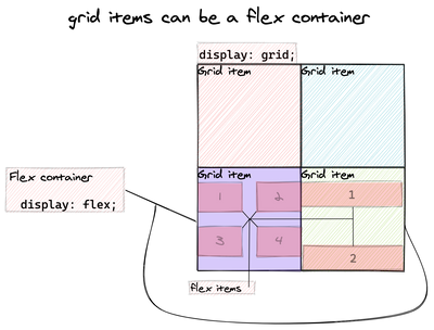
Now that we understand what grid containers are, grid elements are straightforward. Direct children (including anonymous) of a grid container are known are grid elements.
There is no such restriction on defining the layout of grid items. A grid item can be a flexbox container by adding declaration display: flex;. Heck, we can go ahead and add display: grid; to the grid item, and it behaves as a grid container for its child item! This means it behaves as a grid-item for its parent and grid-container for its children. You can call it a nested grid. (not subgrid - that's different)
Grid lines
Grid lines are the basic unit of the grid on which other parts of the grid are built upon. How do we create grid lines? We don't. It's something that gets created (logically) when we define grid template in case of the explicit grid and when grid automatically places content in case of the implicit grid. We'll uncover what explicit and implicit grid is in another post.
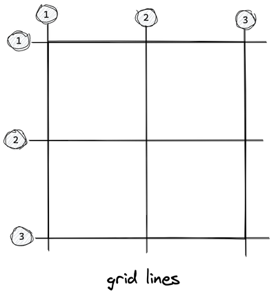
We can refer to the grid lines as numbers via CSS and place the grid items. They start as 1 from the starting edge of flow direction.
Grid track
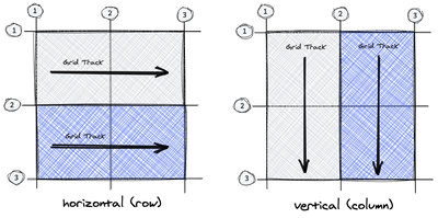
The area between 2 adjacent grid lines is known as a grid track. The direction of the grid tracks can be vertical and horizontal. The vertical direction is the columns and the horizontal direction is rows. (this changes based on the writing mode)
Grid cell
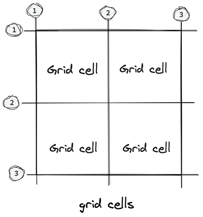
The area between 4 grid lines is called a grid cell, it is the smallest unit of area in a grid.
Grid area
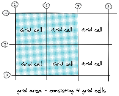
A grid area is the combination of one or more grid cells together. These are accessible via CSS grid properties. We can define the grid areas and place our grid items over those areas.
📌 There is no default direct relation between grid areas and grid items. They are not bounded together by default. Using CSS, we attach the grid items to the grid areas. You can think of grid items are physical elements and grid areas as logical.
Since the control of assigning grid items to grid areas is on us, we can keep some of the grid cells as empty or overlap them with other grid items.
If we don't define any grid area, a default grid area will be created from start to end and our content will be placed on it.
Rows and columns
In an explicit grid, we define the track size and the number of rows/columns using grid-template-columns and grid-template-rows
Here is how we define 3 columns and 2 rows with their corresponding track sizes.
.grid-container {
  display: grid;

  /* 3 columns */
  grid-template-columns: 200px 100px 200px;

  /* 2 Rows */
  grid-template-rows: 300px 300px;
}
Few things to note:
- The track size values can be fixed widths (px, em, rem, %, ch, ...) or flexible widths (fractional spaces, content-based space)
- There is no limitation on defining the number of rows and columns.
Here we have defined only 2 rows, those rows/tracks are part of the explicit grid. If the number of grid items increases which cannot fit inside the explicit area of the grid, then the grid will generate a new row automatically as part of implicit grid. Similarly for columns.
If we place a grid item outside of the defined row, columns. New grid lines and tracks will be created as part of the implicit grid.
How do we place grid items on grid areas? We'll cover that in the upcoming post.
The end
🎨 All drawings were made using Excalidraw
References mentioned in the post
- 📚 CSS - The definitive guide — Eric A. Meyer & Estelle Weyl
- 📹 Start using CSS Grid Layout — Rachel Andrew
- 🔖 Introduction to formatting contexts — MDN
- 🔖 Understanding CSS Layout And The Block Formatting Context — Rachel Andrew
- 🔖 Margins in CSS — Rachel Andrew